
Article
Methylene blue and hormesis: why dose-response curves can change direction
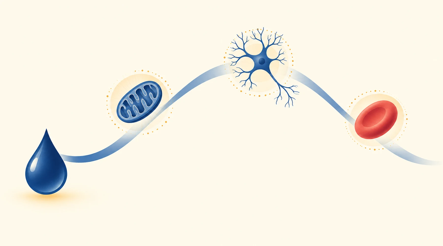
One rat gets 4 milligrams per kilogram of methylene blue after learning to recognise an object, and the next day it remembers. Another rat gets 50, and it barely turns its running wheel. The molecule is the same. The direction of the effect is not. Anyone who has read more than a few methylene blue papers has met this reversal, and it has a name: hormesis, a biphasic response in which low and high exposures push the same endpoint in opposite directions.
The name is useful only if you know what it does and does not promise. This article walks through four published methylene blue datasets, each with its own endpoint, concentration range and experimental setup, and shows why the chemistry of the dye makes such reversals plausible. It ends with the warning the data insist on: a curve that peaks in one experiment is a description of that experiment, not a method for picking a personal dose.
The pattern has a name, and the name is narrower than it sounds
Hormesis was coined in 1943 by Southam and Ehrlich and given its modern quantitative form by Calabrese and Baldwin: an adaptive biphasic response, produced directly or through compensation after homeostasis is disturbed. Note what is missing from that definition. The word beneficial does not appear. Hormesis says the curve changes direction, nothing more.
The shape you see depends on which endpoint sits on the vertical axis. When the endpoint is a positive function such as enzyme activity, oxygen use or memory score, low-dose stimulation followed by high-dose inhibition draws an inverted U. When the endpoint is something bad, such as disease incidence, low-dose suppression followed by high-dose enhancement draws a J or U. Same relationship, different ordinate. Most methylene blue work measures positive functions, so this article speaks in inverted U curves, with the understanding that the letter of the alphabet is a plotting choice.
The 2008 review that collected methylene blue's hormetic responses makes the scale concrete. Across behaviour, physiology and biochemistry, responses inside the stimulatory zone reach roughly 130 to 160 percent of control, averaging near 140, before falling back through control and then below it as dose keeps rising. That band is a summary of many experiments, not a property of the molecule. Each curve below has its own peak in its own units.
Why this molecule in particular should reverse
Methylene blue is not a simple electron donor. It is a reversible shuttle. The oxidised blue form accepts electrons, becoming the colourless reduced form, and the reduced form can hand those electrons on downstream. The electron relay behind these curves is described in the account of how methylene blue moves electrons, and the shuttle is the whole story here.
At low concentrations, that cycling offers respiration an alternative path. The reduced dye can be oxidised at cytochrome oxidase, the terminal enzyme of the electron transport chain, increasing its turnover along with oxygen use and respiratory capacity. At higher concentrations, the same electron-hungry chemistry starts competing with the normal chain instead of assisting it: diverting electrons from their usual route, consuming oxygen directly, and generating reactive oxygen species rather than productive energy. Small catalytic shuttle, more flux; excessive competing sink, less. The chemistry makes a change of direction plausible, though it guarantees nothing about where any particular endpoint will peak.
Independent evidence for the concentration dependence comes from cells with no mitochondria at all. In the 1976 erythrocyte experiments, a low concentration of 1 micromolar stimulated the hexose monophosphate shunt by a route that depended strongly on oxyhemoglobin, while a hundredfold higher concentration of 0.1 millimolar barely cared whether oxyhemoglobin was present and generated hydrogen peroxide by all three assays used. Same dye, two mechanisms, separated by concentration. Red cells cannot respire, so this is not a mitochondrial curve, but it shows the dye's redox chemistry changing character as concentration rises, which is exactly what the mitochondrial story requires.
Four curves, four setups
The figure below redraws the four datasets side by side. Each panel keeps its own axes and conditions, because overlaying them on one scale would be the first lie this article could tell. The drawing is schematic; exact values and conditions are in the text.
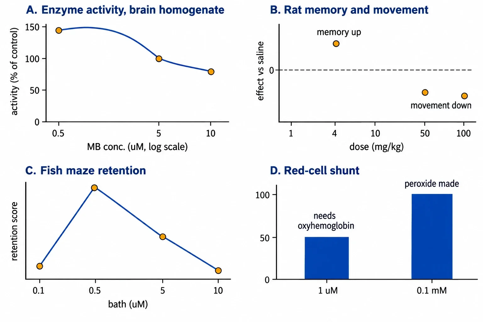
Panel A: cytochrome oxidase in rat brain homogenate. The cleanest mitochondrial curve comes second-hand, plotted in the review from rat-brain-homogenate data: about 138 percent of control activity at 0.5 micromolar, back to control near 5 micromolar, below baseline near 10 micromolar, where the authors suggest the dye is taking electrons away from the chain's normal complexes. Homogenate, micromolar, spectrophotometric assay. That sentence is the whole context, and the curve means nothing outside it.
Panel B: rat memory and wheel running. In the rat memory study, single post-training injections were tested 24 hours later. Doses of 1 to 10 milligrams per kilogram left locomotion and feeding indistinguishable from saline, while 50 to 100 milligrams per kilogram cut wheel running sharply (median 35 versus 279 revolutions) and the top dose produced piloerection, uncoordinated movement and one death. The 4 milligram per kilogram dose improved habituation and object recognition: treated rats spent nearly 10 seconds more on the novel object. Brain oxygen consumption rose both in homogenate exposed to low micromolar reduced dye and in brains taken 24 hours after 1 milligram per kilogram in vivo. Note the separation: behaviour used post-training systemic doses, oxygen use used homogenate concentrations plus one in vivo dose, and they are two experiments, not one curve.
Panel C: zebrafish T-maze. The zebrafish study immersed trained fish for 12 hours after training in nominal bath concentrations of 0.1, 0.5, 5.0 or 10.0 micromolar, against a blue food dye control. The 0.5 micromolar group performed best, the 5.0 group matched control, and the 10.0 group performed worse than the lower-dose groups. Two cautions come with the panel. Bath micromolar is not blood or brain micromolar; distribution and accumulation sit between the tank water and the tissue. And the statistics are weaker than the shape suggests: the high dose differed from the lower-dose groups, with no other significant group differences reported. The curve is real but rough.
Panel D: the erythrocyte shunt. Metz and colleagues compared 1 micromolar against 0.1 millimolar in human red cells under air, carbon monoxide, and a mixture giving near-total carboxyhemoglobin at physiological oxygen pressure. Low-dose stimulation collapsed without oxyhemoglobin; high-dose stimulation barely noticed. Peroxide appeared only at the high dose. This panel belongs beside the others as chemistry, not as a fourth point on some master curve: no mitochondria, hundredfold concentration gap, manipulated gas mixtures.
Why the peaks do not agree, and should not
The four peaks sit at 0.5 micromolar in a homogenate, 4 milligrams per kilogram injected after training, 0.5 micromolar in tank water, and a low-versus-high pair a hundredfold apart in red cells. Treating any two as the same number is a category error. Each endpoint has its own curve: the optimum for memory need not match the optimum for oxidase activity, oxygen consumption, locomotion or peroxide production. Each concentration unit means something different: homogenate micromolar, nominal bath micromolar, systemic milligrams per kilogram, plasma, brain and mitochondrial concentrations are different quantities, and methylene blue's tendency to accumulate in mitochondria and brain keeps them apart. Each model adds its own pharmacokinetics: species, route, and timing decide which tissue meets how much dye for how long.
This is also where the role of dose and route in methylene blue safety matters, since the high-dose effects in these papers, motor suppression, uncoordinated movement, one dead rat, peroxide generation, are toxicity signals in their own setups, not safety margins for anyone else. And anyone tempted to convert 4 milligrams per kilogram in a rat into a human regimen should read how animal findings relate to human evidence first: simple milligram-per-kilogram conversion across species is inadequate.
The mistake to avoid
The inverted U is seductive because it looks like a dosing dial with a sweet spot marked on it. It is not. Hormesis describes what happened to one endpoint in one setup. Stack four such descriptions and you get four peaks in four unit systems, which is the opposite of a dial. The honest use of these curves is comparative and cautionary: expect effects to reverse with concentration, expect each endpoint to reverse at its own point, and distrust any claim that borrows one experiment's peak to justify a dose in a different species, route, tissue or purpose. The distinction between experimental patterns and personal dosing decisions is the point of this entire article, stated once more so it is not missed.
How to read the next dose-response paper
Four questions fit almost every methylene blue curve you will meet. Which endpoint is on the vertical axis, and would its reversal draw a U or a J. Which concentration the horizontal axis actually reports: nominal bath, homogenate, plasma, estimated brain, or administered systemic dose. Which model and timing produced it: homogenate, cell culture with the lights on or off, trained animals dosed before or after training, tested when. And what the control was: saline, blue food dye, vehicle, and whether the paper's statistics support each pairwise claim or only the overall shape. A paper that answers all four is worth your time. One that reports a peak without them has given you a number without an address.